TrueBlarks
Ethereum data on crack
I wanted to share with you (through a series of charts) what happens when one releases a world-class data scientist such as Ed Mazurek on fresh-baked Ethereum difficulty data.
You get TrueBlarks (that’s a portmanteau of “TrueBlocks” and “R” in case you were wondering). If you don’t know about “R” and R Studio, you should. It’s amazing.
With little to no explanation, I am going to copy and paste the “R” code right next to the chart used to create it. Ask Ed what the code means.
The comma-separated data looks like this:
block.number,timestamp,difficulty
1,1438269988,17171480576
2,1438270017,17163096064
3,1438270048,17154715646
4,1438270077,17146339321
…
One record for each of the 7,105,056 blocks that had been produced at the time of this writing. Here’s some preliminary setup code that reads the data and cleans it up a bit.
require(tidyverse)
require(scales)
require(dplyr)
require(magrittr)
homestead.block <- 1150000
byzantium.block <- 4370000
bin_size <- 200
period_size <- 100000
sample_size <- 50000
difficulty <- read_csv(‘difficulty-generated-1a.csv’) %>%
filter(block.number > homestead.block) %>%
mutate(block.bin = floor(block.number / bin_size) * bin_size) %>%
mutate(fake.block =
ifelse(block.number >= byzantium.block,
block.number — 3000000,
block.number) + 1) %>%
mutate(period = floor(fake.block / period_size)) %>%
mutate(bomb = 2 ^ period) %>%
mutate(parent.difficulty = lag(difficulty)) %>%
mutate(parent.ts = lag(timestamp)) %>%
mutate(diff.delta = difficulty — parent.difficulty) %>%
mutate(ts.delta = timestamp — parent.ts) %>%
mutate(diff.sensitivity = diff.delta / difficulty) %>%
mutate(ts.sensitivity = ts.delta / timestamp)
current.block <- difficulty$block.number %>% tail(1)
current.bomb <- max(difficulty$bomb)
The Code
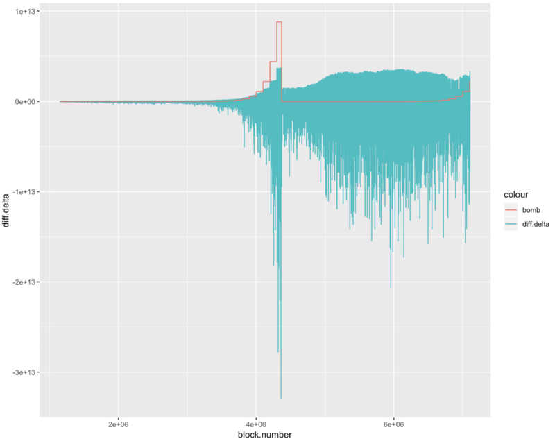
Here’s the code for our first chart:
difficulty %>%
sample_n(sample_size) %>%
group_by(block.bin) %>%
ggplot(aes(x=block.number)) +
geom_line(aes(y=diff.delta, color=’diff.delta’)) +
geom_line(aes(y=bomb, color=’bomb’))
And here’s the first chart showing the delta in each block’s difficulty through the first 7.1 million blocks. It also shows, as a red line, the difficulty bomb. You can see it’s creeping up again.
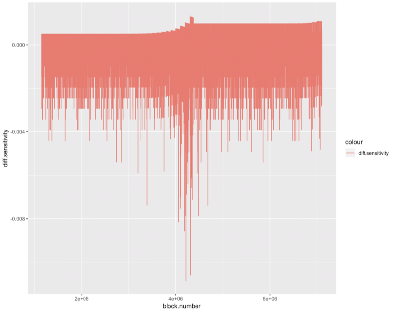
The next chart, built with this code,
difficulty %>%
sample_n(sample_size) %>%
group_by(block.bin) %>%
ggplot(aes(x=block.number)) +
geom_line(aes(y=diff.sensitivity, color=’diff.sensitivity’))
shows the ‘responsiveness’ of the difficulty calc to its current situation. We calculate sensitivity by dividing diff.delta by block.difficulty. I’m not sure, but I think the jaggys come from the way the difficulty value is calculated. It snaps to the next nearest 10 seconds to adjust, so 10, 11, 12, … 19 all give the same adjustment, but 20, 21, 22, … give different adjustments.
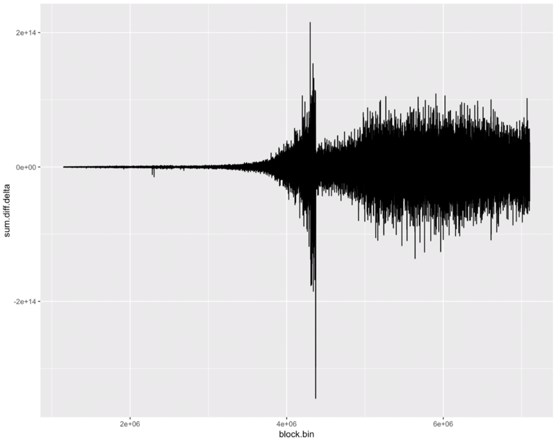
The next chart, generated from this “R” code,
difficulty %>%
group_by(block.bin) %>%
summarize(sum.diff.delta = sum(diff.delta), na.rm=T) %>%
ggplot(aes(x=block.bin, y=sum.diff.delta)) +
geom_line()
shows the accumulated sum of the diff.delta values. You can clearly see the battle waged by the pre-byzantium difficulty bomb. Up, down, up, down. The fact that the difficulty hovers around a target is exactly what the difficulty calc is supposed to do. It keeps the timing of the blocks consistent.
Lane Rettig wondered if, because of the increased hash rate of the current chain, the effect of the difficulty bomb might be obscured. I’m not sure (I’m not sure of anything), but the wider spread of the difficulty on blocks since byzantium may indicate that his intuition was correct. Is the difficulty bomb hiding in the big black static?
In the following charts, we show some other shit made with some more “R” code. In this section, we calculate either the deltas of the means of the timestamps of the blocks or the means of the deltas of the timestamps of the blocks and we lay whatever that is against the previous charts (you’ll have to ask Ed if you want to understand it).
difficulty %>%
group_by(block.bin) %>%
summarize(sum.diff.delta = sum(diff.delta, na.rm=T), mean.ts.delta = mean(ts.delta, na.rm=T)) %>%
gather(key = vars, value = val, -block.bin) %>%
ggplot(aes(x=block.bin, y = val)) +
geom_line() +
facet_wrap(facets = ‘vars’, scales = ‘free’, ncol = 1)
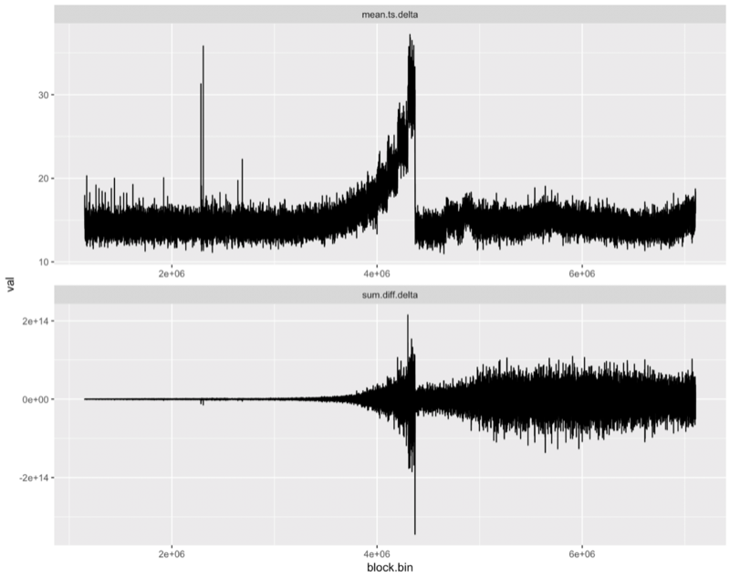
And now we’re just showing a whole bunch of crazy charts with cool looking black jaggies (hang in there, there’s some interesting stuff below).
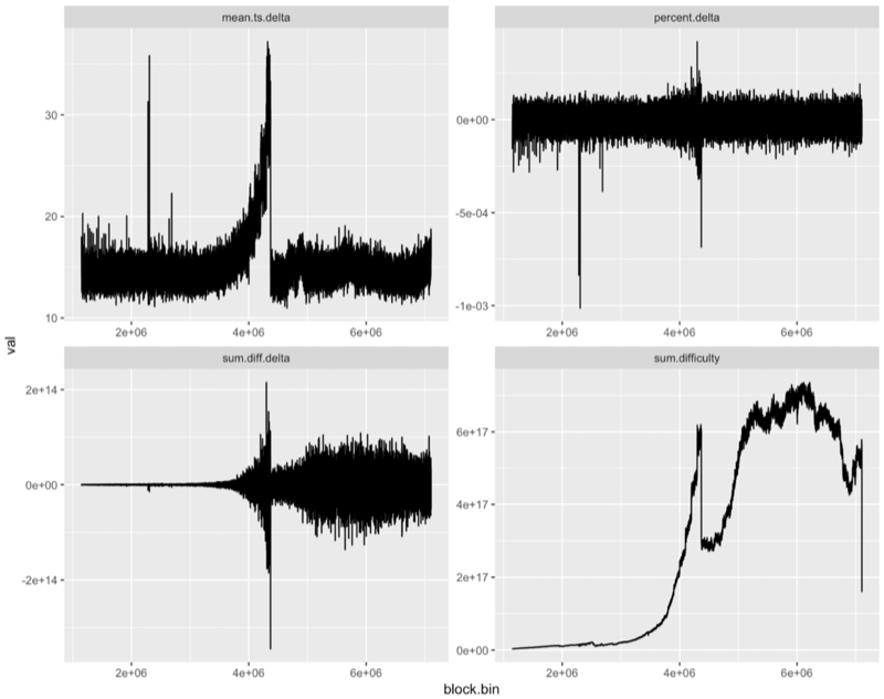
The above chart was made with this nearly unintelligible code:
difficulty %>%
group_by(block.bin) %>%
summarize(sum.difficulty = sum(difficulty), sum.diff.delta = sum(diff.delta, na.rm=T),mean.ts.delta=mean(ts.delta, na.rm=T)) %>%
mutate(percent.delta = sum.diff.delta / sum.difficulty) %>%
gather(key = vars, value = val, -block.bin) %>%
ggplot(aes(x=block.bin, y = val)) +
geom_line() +
facet_wrap(facets = ‘vars’, scales = ‘free’, ncol = 2)
Finally, Something Truly Interesting
Ed and I were inspired to work on the problem of the Ethereum’s difficulty calculation at the Status Hackathon in Prague back in October by Lane Rettig. He was concerned that the hash rate of the current chain, which was so much higher now than it was during the pre-byzantium bomb, would obscure the bomb longer, and then, once it exploded, it would take people by surprise.
We wanted to see if his intuition was correct.
A quick word about the bomb. It explodes in a exponential growth curve doubling every 100,000 blocks. This has the effect of creating a saw tooth curve, as the chain responds to dampen the rise in difficulty, as we discussed in a previous post.
In this next set of charts, we’ve bucketed the data into buckets of 100,000 blocks and called these buckets periods. (The black line below shows the current period.) This bucketing is evident in the following chart where we also broke the data into groupings: pre-byzantium and post-byzantium. This allows us line up and compare the two exploding bombs.
What do we see when we look at the data this way? First, we see that the post-byzantium bomb is beginning to rear its head.
difficulty %>%
mutate(era = ifelse(block.number <= byzantium.block, ‘before byzantium’, ‘post byzantium’)) %>%
sample_n(sample_size) %>%
ggplot(aes(y = diff.sensitivity, x = period, color=block.number)) +
scale_colour_gradient2(low = “red”, mid = “green”, high = “blue”, midpoint = byzantium.block, space = “Lab”, na.value = “grey50”, guide = “colourbar”) +
geom_point(size = point_size) +
facet_wrap(facets = ‘era’, nrow = 2) +
geom_vline(xintercept = 41)
The above code gives us this chart:
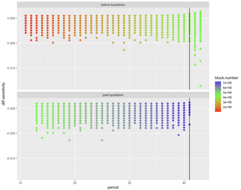
And here, I think, we’ve finally gotten to something interesting. Although, we’re not quite done.
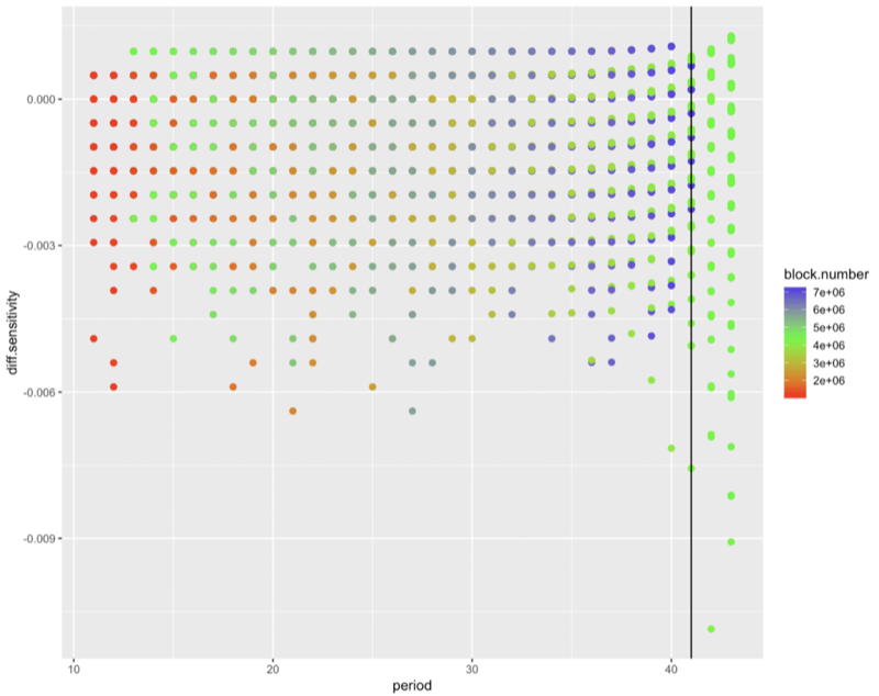
Next, we lay the post-byzantium data and the pre-byzantium data on top of each other.
What we see now, if we look closely enough, is that the little purple dots (current bomblets) are lower down than the little green dots (previous bomblets).
Lane was right! This time, the effect of the difficulty bomb will be obscured and be less apparent than before. This may make its effect less obvious until it explodes. How soon will that be? When is the bomb coming? We’re already at period 41. The last bomb (see this chart) started showing a slow down by now. The last bomb was already starting to speed up by now. I think that is true this time as well, but it’s hidden behind the heavier hash rate.
Conclusion
It’s time to fork.
Thomas Jay Rush owns the software company TrueBlocks whose primary project is also called TrueBlocks, a collection of software libraries and applications enabling real-time, per-block smart contract monitoring and analytics to the Ethereum blockchain. Contact him through the website.