Playing with Blocks
And having fun while doing it
I am so deep down the rabbit hole of Ethereum data that I sometimes forget there is such a thing as the real world. And I care exactly zero if I never come up. Don’t ask me why. I’m pretty sure there’s no good reason.
Maybe my obsession with this has to do with something that happened to me in high-school. My guidance counselor administered a test intended to identify which career I should pursue. She watched me take the test and then carefully scored my answers. When she was done, she looked across the table and said, “You should look for careers that have nothing to do with people.” The remaining options for me where making things (factory work) and information processing. I took the latter path.
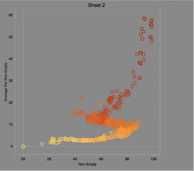
I’ve written software called TrueBlocks (http://trueblocks.io) that scans the Ethereum blockchain looking for interesting data. TrueBlocks allows me to easily summarize and accumulate data at each block. From there, I can make pretty pictures. Here is one such picture:
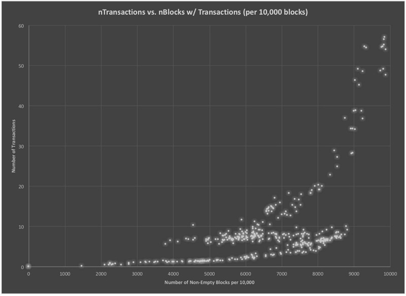
Each dot on this chart summarizes two characteristics about groups of 10,000 blocks. We scanned the first 4,000,000 blocks on the Ethereum chain and summarized the number of non-empty blocks in each group vs. the average number of transactions in each group. This created 400 data points (4,000,000 / 10,000 = 400).
On the horizontal axis, we plot the number of non-empty blocks in each group Non-empty blocks are blocks with at least one transaction. The dots at zero-zero (the lower-left corner of the chart) represent groups with zero transactions. (These are most likely blocks at the start of the chain — the first transaction happened around block 47,000.) The left side of the chart represent groups of 10,000 blocks where nearly all are non-empty (i.e. have at least one transaction).
The vertical axis shows the average number of transactions inside the non-empty blocks in the group. At the bottom of the chart are groups of 10,000 blocks that average between zero and ten transactions per block. Near the top-right of the chart are a small number of groups that average between fifty and sixty transactions per non-empty block.
What Does it Mean?
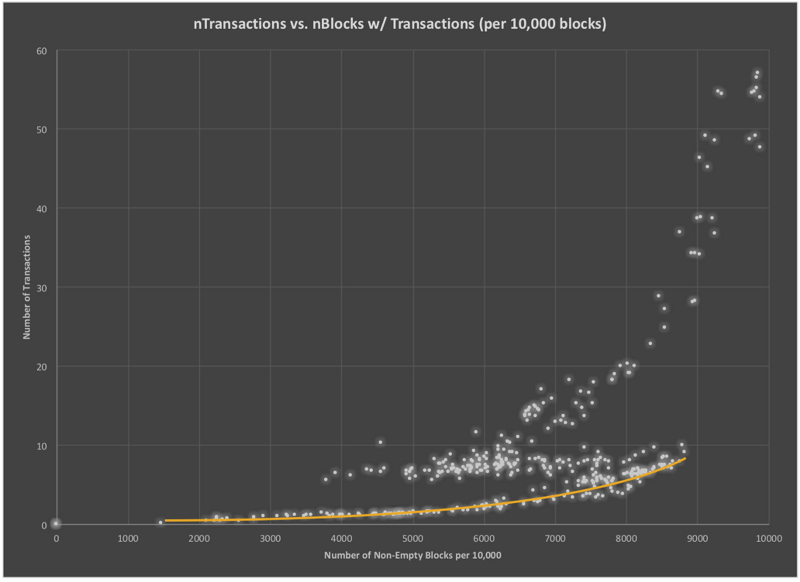
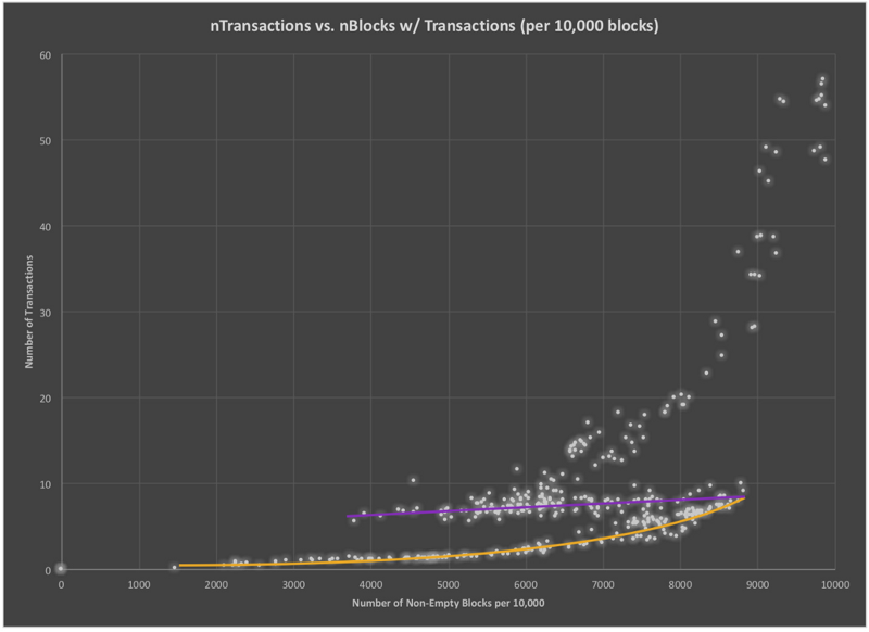
We wondered if there was anything interesting to be gleaned from the data. Do you see anything? I something of a pattern, but I’m not sure I understand what it means. There appears to be three distinct groups in the data. The first one, I’ve marked with an orange line.
The second group of data is the purple line.
And the third is the green line.
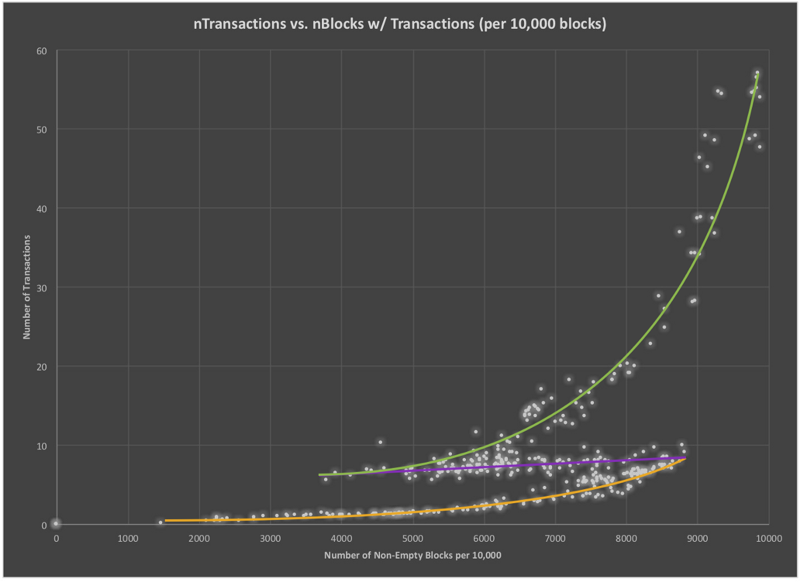
I hate to admit it, but I have no good explanation for why the data looks like this. I’ll give a possible explanation below, but I welcome any and all suggestions about other ways to look at it. Add your comments below.
Possible Explanation
My initial thought was that these patterns have something to do with the Ethereum mining software. I thought perhaps there are three different mining algorithms that miners naturally fall into. Something to do with profits, no doubt. But how to figure out if that hypothesis was true? No idea.
I decided to look at a simpler problem: when were these blocks produced?
The three charts above have no time component. To alleviate this problem, I colored the dots by block number. Here’s the same data above with the dots colored by block number.
In this chart, earlier block numbers are colored yellow. The color tends toward dark red the higher the block number gets. Clearly, as the chain progressed, there was an early period with many empty blocks with relatively few transactions. Towards the middle of the chain’s lifespan (between December of 2016 and June of 2017, perhaps) there seems to have been a retreat.
Near the end of the early period, the number of empty blocks was decreasing as the average number of transaction rose (as yellow bleeds into orange). But then, for some reason, the chain makes a retreat. While the average number of transactions per block continued to increase, the number of non-empty blocks per 10,000 also shrank.
Why Does This Happen?
I didn’t really have a good explanation of why this retreat happened. I thought it might be possible that retreat was just an artifact of the way I was presenting the data. So I tried to dig deeper into that thought.
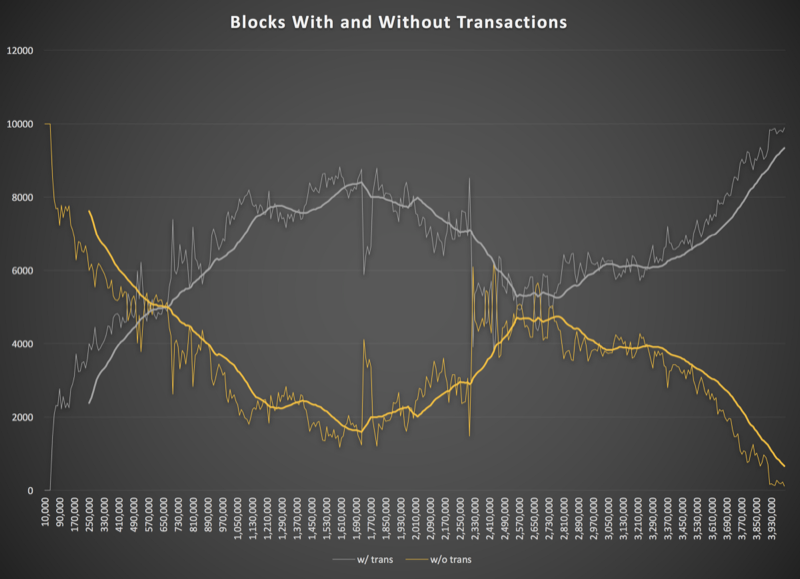
Next, is a chart showing the number of non-empty blocks plotted against the number of empty blocks. Obviously, if you lose on from one side, you gain one from the other, so the two lines mirror each other.
But does this explain the reason for the retreat? Perhaps it does. It looks like something happened around block 1,700,000 (the high point of the grey line near the middle of the image). What happened around block 1.7 million?
Let’s see. Could it be…oh, I don’t know…could it be….the devil? Yes! It was the devil.
The DAO hack happened at block 1,718,497. Within days of the hack, the price dropped from $21.00 US to about $8.00. Three months later, there was the October 2016 DDos attack. You can see it in the spikiness around block 2,250,00. Did these two events cause a retreat in the activity on the chain? More empty blocks with less transactions per block? It seems likely to me.
We’re interested in your thoughts. Please clap for us and post your comments below. Please consider supporting our work by sending a small tip to 0xf503017d7baf7fbc0fff7492b751025c6a78179b.
Thomas Jay Rush owns the software company TrueBlocks whose primary project is also called TrueBlocks, a collection of software libraries and applications enabling real-time, per-block smart contract monitoring and analytics to the Ethereum blockchain. Contact him through the website.